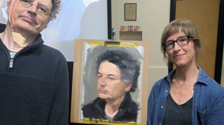
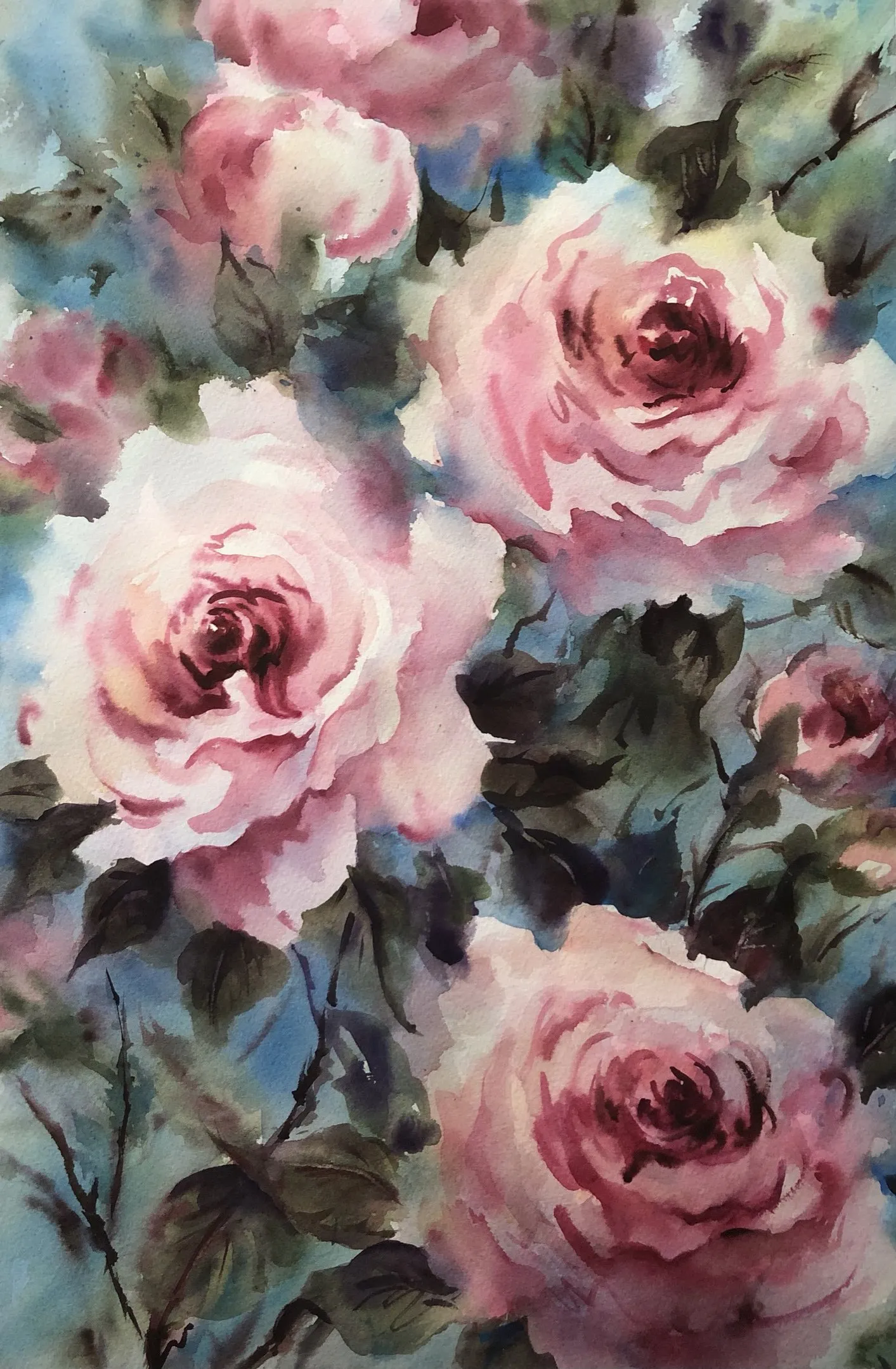
 On Tuesday 16 June from 7.30pm to 9.30pm, Buckinghamshire based artist Nicky Hunter gave a live demo on creating flamboyant florals in watercolour. Below are notes taken by Nicola Webb throughout the demo.
Uses 300gsm weight paper. Rougher paper and larger brush to get expressive marks. Lots of water! Uses 4 brushes including 2 squirrel mops. Colours: sennelier lemon yellow the best yellow, as it’s the most transparent. Also cotman colours are good. Uses few colours, possibly only 4 or 5. Permanent rose pink a favourite for flowers – finds it transparent and mixes well. Only struggles with getting a transparent cerulean.
Mixed 3 blushes. Blue/grey wash. Only ever mixes greens. Gets several greens pre mixed. Tries to stick to 2-3 colours per mix max. Tries all out on a strip of w/c paper next to the easel.
Draws a ‘sensible scribble’ to get loose shapes and sizes, and see them in relation to one another. Wets paper. Adds wet sky wash. Happy to let it drip. Add in touch of cerulean to carry the colour. Loosely goes around the leaves. Dabs out colour in some areas, especially when wants it white. Doesn’t use masking fluid. Too hard a finish.
Dabs on greens. Wants soft edges. So dabs away any hard edges. Work over the entire paper, quickly, to get soft edges.
Adds pinks in 2 shades. Happy if it blends a little. Adds structure of petals. Lifts out with synthetic brush as works better than natural bristle. Adding deeper tones when damp.
Important to keep enough white areas, or pale yellow, then go darker to add shapes. Then after outline of 2nd flower, adds greens. Can use a little water spray if dries too quickly but beware, as it can dilute the pigment too much.
Important to let the layers dry. Keep adding layers and the colours will muddy or you get cauliflower edges.
Building up greens. Darker mix to get contrast – blue, yellow and a touch of brown. Working wet in wet again. Scratch highlights in leaves with a fingernail. Put one or two identifiable leaves in the foreground and the rest are looser and just shades of green. A few quick marks to get a leaf shape. Don’t keep going back in. Leaves are there to define the shape of the flowers. Stems and leaves help lead the eye through a painting.
Works in same way building up leaves, stems and 2nd flower, making the centre darker. Happy for bottom right colours to be darker, muddier to contrast with the fresh flower.
Much darker centre of 1st flower to get tonal contrast. Really push the colour tones. Same for 2nd main flower. Adds ultramarine blue and burnt umber into the permanent rose.
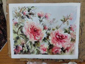 Steps back and looks at picture as a whole. Slight tweaks to leaf shadow, light areas.
And voila, a beautiful expressive floral!