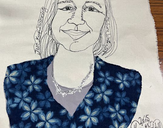
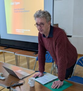
 WADAC’s 2026 AGM was followed by a short illustrated talk by David Woodward entitled Odd Types – a fascinating journey through the history of typefaces.
He started by explaining that a typeface was a family of fonts, including – for example – the bold and italicised versions, while a font was one particular style within that family.
Some of the most popular modern typefaces are:
Comic Sans – created by a Microsoft employee, orginally for children but its use has spread.
Arial – a version of Helvetica and used heavily in office documents.
Calibri – designed by Lucas de Groot and one of the best typefaces for legibility on screens of all types.
David took us through a few of his design heroes, starting with Trajans Column. Created in 113 AD, the inscription on this Greek column has been held to be the ideal form of classical lettering and has spawned many equally noble and elegant fonts, including Trajan Pro Regular, which is still used today.
Then there was the German, Johannes Gutenberg, who is hailed as the inventor of printing in the 1400s. David confirmed this wasn’t the case, as the Chinese were using printing processes as early as 168 AD. However, Gutenberg did invent a moveable type press, together with molds to cast type. He was able to print 300 pages a day, which was much faster than the hand scribes of the time. He created the Gutenberg Bible, though he made it look like a facsimile of a manuscript.
Beatrice Ward was a publicist in the 1930s for the company Monotype, which created and popularised many of the fonts we still use today. Beatrice said that a good typeface is “A crystal goblet – revealing the beautiful thing it contains”. She meant not just the text but that it should communicate emotion and aesthetics too.
Monotype’s biggest seller has been Times New Roman, created for The Times newspaper in 1932, and specially designed to be condensed for use in narrow columns, whilst retaining great legibility.
Centaur is a favourite typeface of David’s – invented in the 1920s by Bruce Rogers, and particularly used in book design, it is modern, elegant and very legible.
David finished his fascinating talk with photos of Ralph Beyer‘s work. Ralph was a stonemason and letter cutter whose work features heavily in Coventry Cathedral, especially the eight large tablets of The Word. Inspired by early Christian inscriptions in Rome, Ralph created hand-worked lettering that was informal, flowing and full of vitality.
David is a successful graphic designer based in Sonning, Berkshire. He is a former lecturer at Reading University, a published author, and a regular speaker for The Arts Society. He’s also currently learning the skills of life drawing, so brings both professional insight and a practising artist’s perspective to his work. It promises to be an engaging and enjoyable evening.